Letterpress printing attracts designers, writers, poets and artists – in fact anyone interested in language and form. Letter-arts including calligraphy, letter cutting, as well as a very small number of people practising punch cutting are all members of this very broad fraternity. If you have a passion for letterpress, there is a high probability that you are also fascinated by one of the other disciplines listed above.
During the process of working with type (in three dimensions), holding, placing and printing single letters composed into words, sentences and paragraphs it is quite easy to develop a curiosity for the design and characteristics of each, individual letter. Applying someone else’s font to design and print is one discipline, but to actually design a completely functioning typeface to use yourself is quite a different one.
This fascination for type design has definitely emerged in a number of LPW attendees. Being involved, experimenting or who are currently engaged in designing type. Some as part of their creative practice and others within their work as graphic designers, typographers and artists.
… … …
Developments in digital software and reductions in cost today, make digital type design an easily accessible platform for both students and professionals. Programmes like Glyphs afford a fast way to translate a few sketches into a working digital typeface (it is a little more complicated than described, but still a lot easier than it was twenty years ago).
One driver pushing the interest in type design within the LPW fraternity is the necessity to replace lost or damaged components in a letterpress collection – helping to successfully complete a case of display type for example. A very common need with owners of wood type, due to the fragility, age and condition of the letters. Others foster a desire to translate personal designs into a physical state – overlapping contemporary digital technology with historic analogue processes (see A2 3D below) – expanding the catalogue of materials for contemporary letterpress printing.
Luckily, the same digital code which translates a small number of outline vectors into each letterform (generating a single letter) is used for both on-screen type as well as the ingredients to physically manufacture a letter. Active when programmed into a digital router, CNC or laser cutter.
The issues arise when actually trying to produce a broad range of different letter forms set out accurately across a baseline and machined to a dedicated type height. At this point a high proportion of people often end their fascination with the process looking for others to fulfil the need. Luckily there are a number of people who have dedicated a great deal of time, energy and effort to successfully complete the challenge and continue to do so.
… … …
The following lists a few example projects of LPW attendees who have been experimenting with type design and succeeding with the process. Work which sits comfortably in the digital arena and others which strides across the divide, spanning both digital and analogue.
… … …
Matthias Beck – Graciosa (P22)
Graciosa is a five weight font family based upon designs for a metal type by Carlos Winkow (1882 – 1952), a German type designer who lived and worked in Spain in the early twentieth century. Matthias began developing a revival of these designs in 2005. Over a long period of time Matthias developed the character set, expanding it for use in twenty-one different languages!
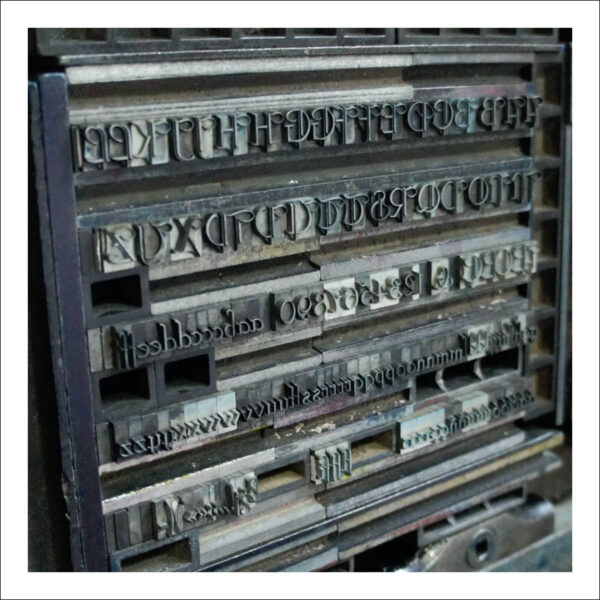
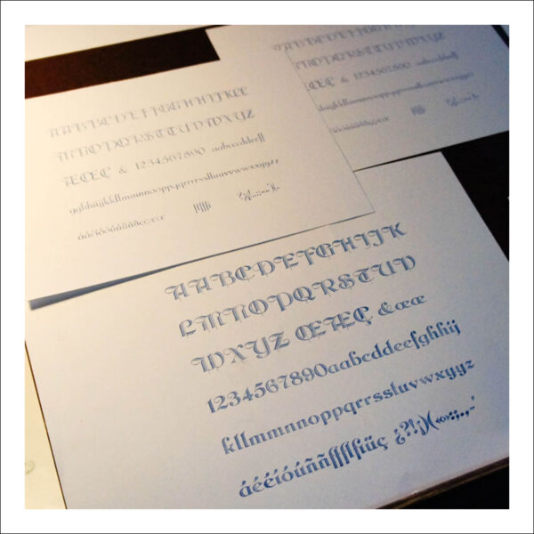
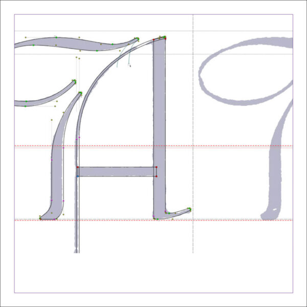
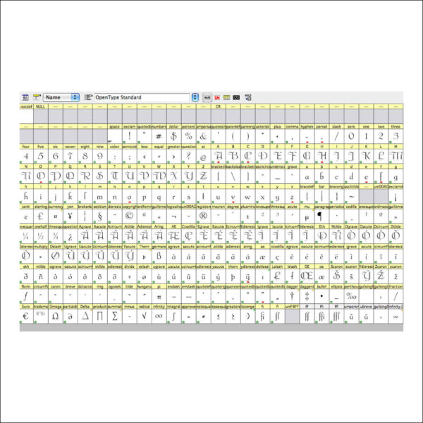
Further details of the project can be found at: https://p22.com/family-Graciosa
Matthias has also been developing a range of modular type for letterpress printing and continues to stride toward letterpress production.
… … …
Stéphane de Schrevel – Cesca (work in progress)
Digital technology affords a contemporary platform to expand the parameters of what we traditionally understand a typeface to be. Stéphane has developed and designed a variable typeface featuring a width-axis, giving the user the opportunity to choose between mild Trajan width proportions and a further option with brutally exaggerated differences in character width. It was initially completed to use for a book commission. Stéphane is currently in the process of developing it further.
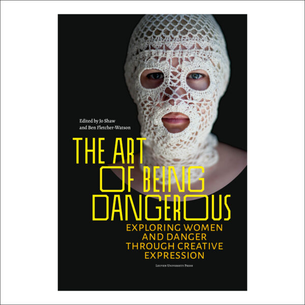
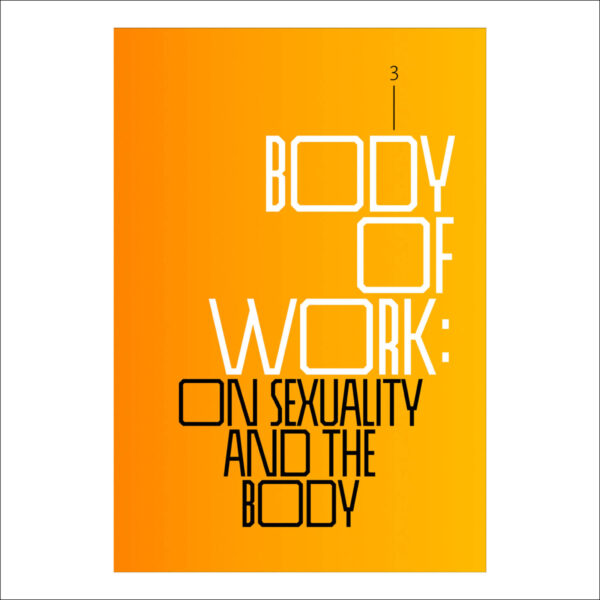
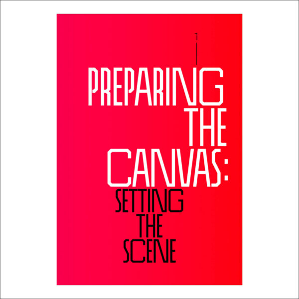
The Art of Being Dangerous – Exploring Women and Danger Through Creative Expression. Leuven University Press https://lup.be/products/172126
… … …
New North Press – A2 3D
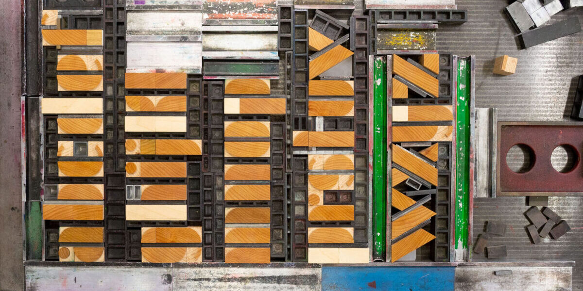
A 3D printed letterpress font commissioned by Richard Ardagh of New North Press. This contemporary, prototype font connects the newest and the oldest forms of print technology (digital and analogue). A type design translated into CAD files, 3D printed and set on type high blocks specifically for letterpress printing. The completed font sits comfortably alongside the historic type collection and is regularly in use in the workshop at New North Press.
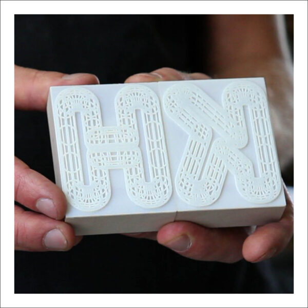
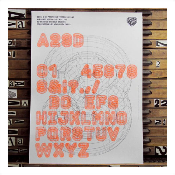
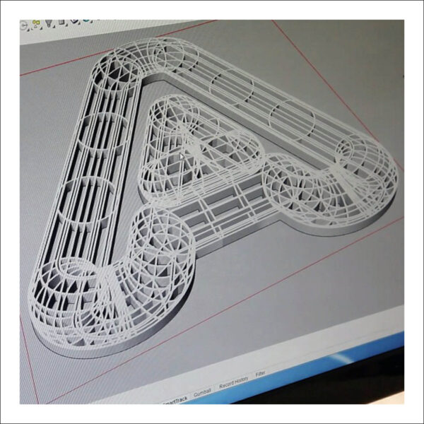
There is a short film detailing the process and project at: https://vimeo.com/106092839
Designer: http://www.a2swhk.co.uk/
… … …
Marko Drpić – Alica
Marko has been engaged in a project to digitise, manufacture and produce new wood letters for letterpress printing. A process which during its research stages took him to the United States visiting some of the last remaining type manufacturers. Marko has navigated every stage personally, informing his detailed understanding of the process – this includes the procurement and machining of wood blocks, digitally translating each letter form for production, manufacturing patterns for tracing, routing each letter and of course printing with the final products.
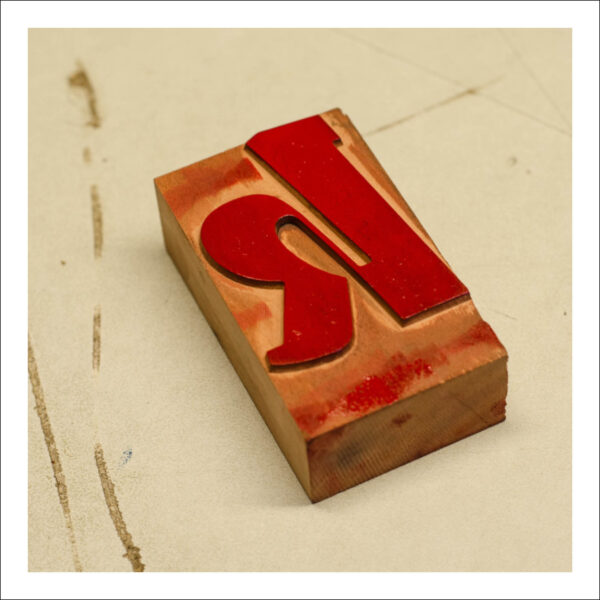
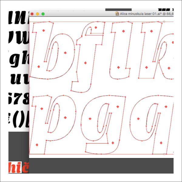
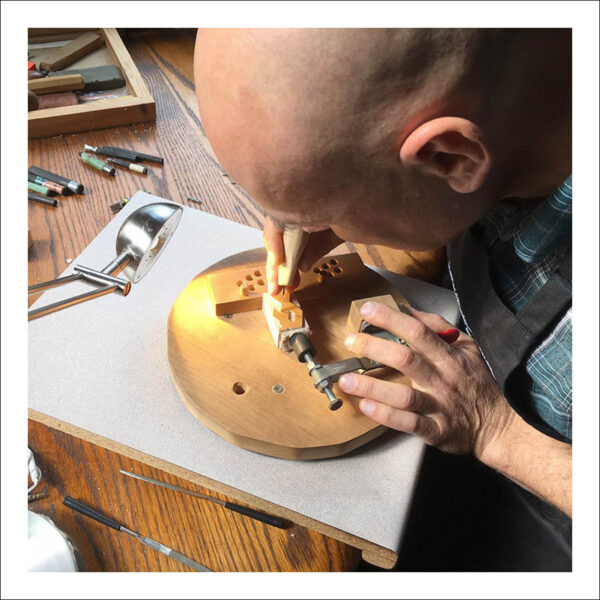
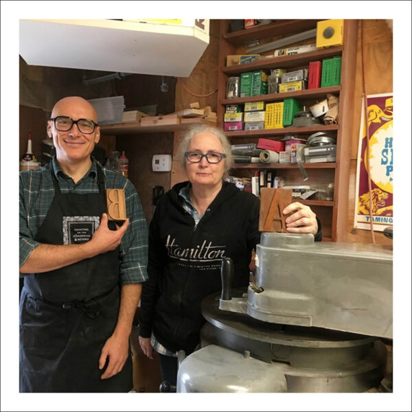
There is a detailed write up of Marko’s research at: https://uia-initiative.eu/en/news/workshop-preparation-production-wood-type-printing
Picture: Marko Drpić and Gery McCorrick at Virgin Wood Type
… … …
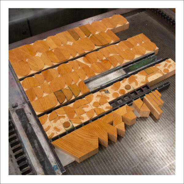
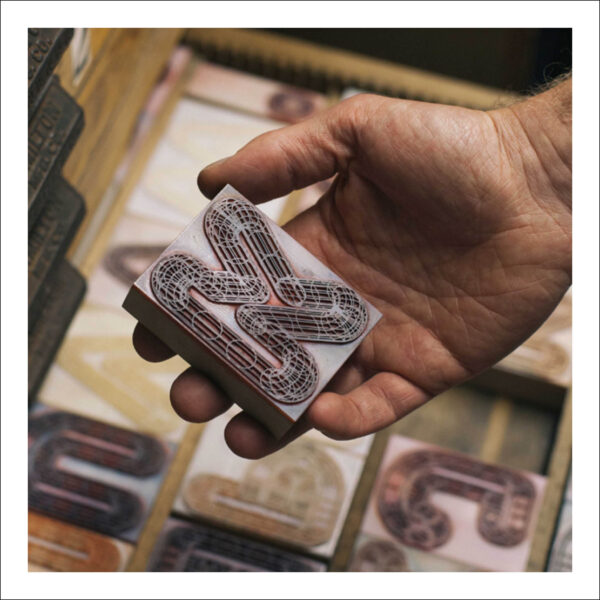
Guillaume Bétemps – Super Circus
An experimental mono-spaced font was created in collaboration between l’Atelier à l’Envers and the design studio Superscript2 in Lyon for the 2018 edition of a music festival called ‘Radio Meuh Circus Festival’. A woodblock version was laser cut in order to make the artists print backstage, creating a series of limited edition posters during the festival.
Guillaume spoke about the project during his presentation at LPW 2018 – he also bought a set of wood blocks for attendees to experiment with. The mono-spacing make letterpress composition and design a very fast process. The font is also accompanied by a number of geometric, modular ornaments adding to its functionality.
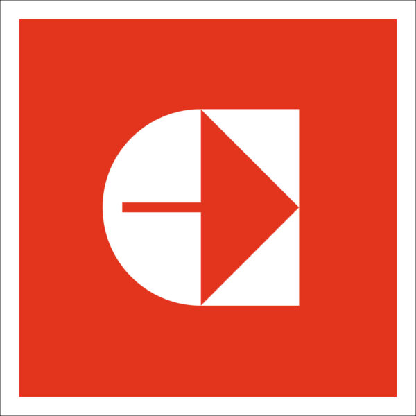
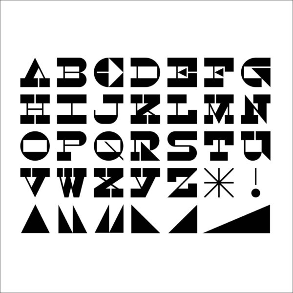
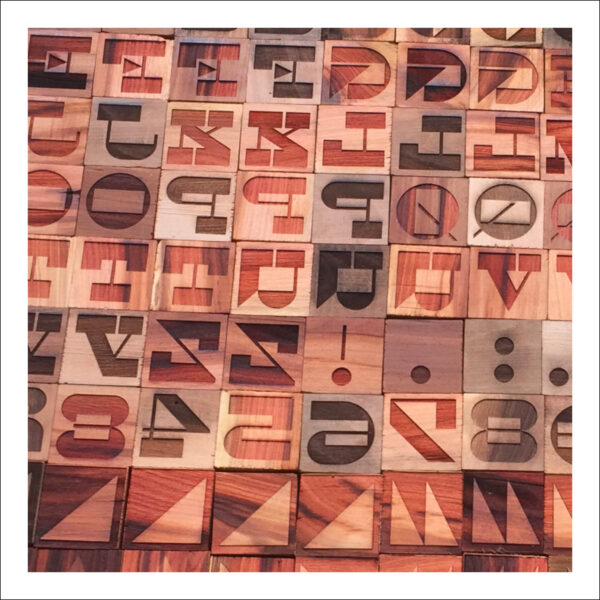
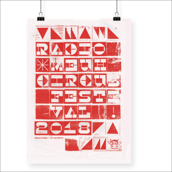
Type Designer: Superscript²
… … …
Dafi Kühne – Poster Design
The work of Dafi Kühne pushes letterform design to the extreme – manipulating, distorting and re-presenting historical, contemporary and experimental typefaces in the production of his commercial letterpress posters. He combines gestural marks, hand crafted components whilst embracing laser cutter, routing, CNC, in fact anything he can get his hands on in the pre-production process. His approach to digital manipulation and digital design are key factors, informing his analogue work.
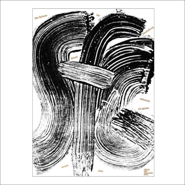
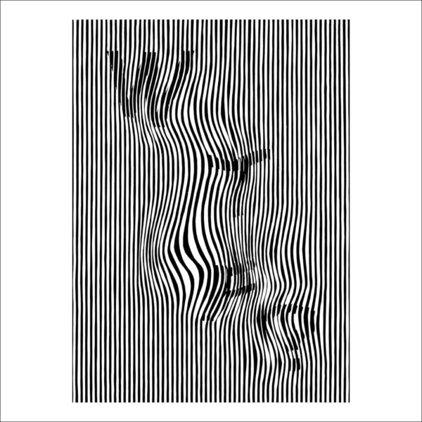
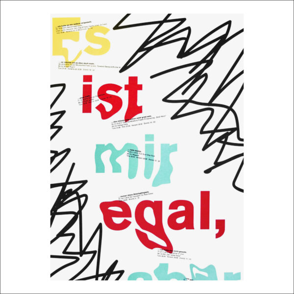
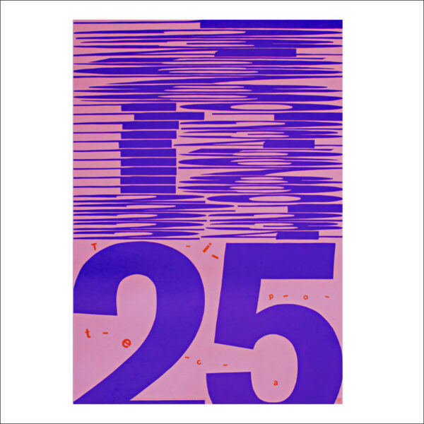
His poster work can be found on his personal website at: https://www.babyinktwice.ch/
… … …
Carl Middleton – A to Z
A large number of design commissions (specifically branding) demand bespoke typo/graphic elements. As a result, I am constantly designing single letters / word combinations. The majority of these lay dormant once the commission is completed but a number have been re-visited and developed into complete alphabets. The process (like letterpress) is time consuming, but very enjoyable.
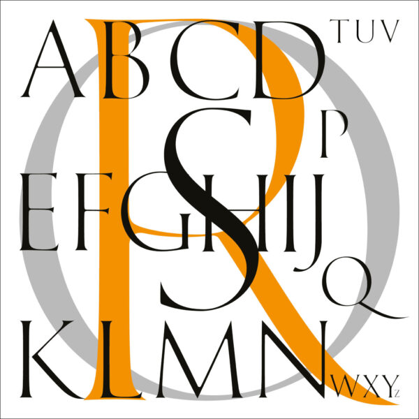
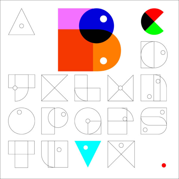
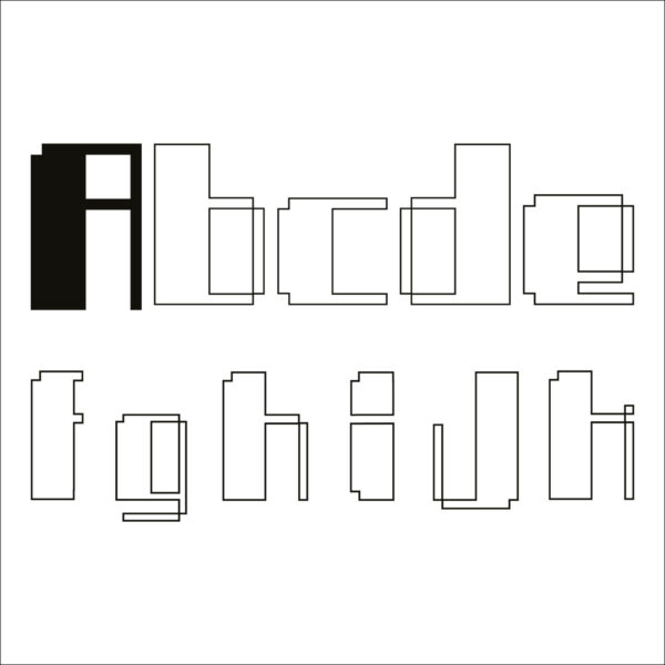
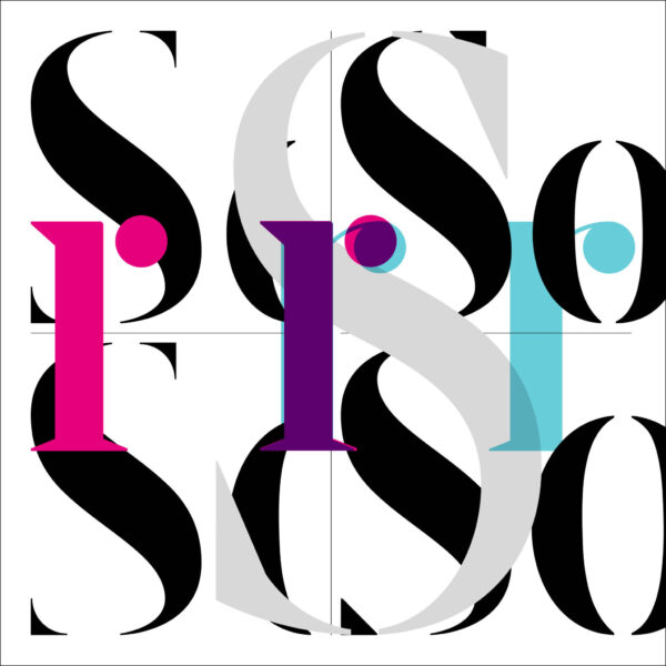
These and other projects can be found at: https://carlmiddleton.co.uk/
… … …
This is not an exhaustive list of all the type design projects that LPW attendees are engaged within, simply a brief insight into a few examples. If any LPW attendees have a type design project you wish to be included, please get in contact and I will expand the list.
… … …
Thanks Carl
That is super interesting and inspiring!
Luise x