The first quarter of the twentieth century witnessed an artistic revolution without equal in the history of art. Looking specifically at the works generated in the few years leading up to the First World War, the principles of modern art, architecture and design then established impact upon the manner in which we experience, approach and live our lives today.
In 1923 Wassily Kandinsky circulated a questionnaire within the Bauhaus, asking respondents to select and paint a triangle, square, and circle using only one of three primary colours. The findings of this basic process would help inform colour theory and go on to define approaches to design thinking – impacting thereafter across the disciplines of fashion, graphic communication and architecture.
The three basic shapes, used in Kandinsky’s experiment either applied singularly, repeatedly or in sequence can be seen on some of the earliest artefacts relating to human existence. These include ceramics, textiles, buildings and approaches to urban design. Geometric forms employed to decorate, punctuate and inform structure and space.
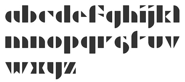
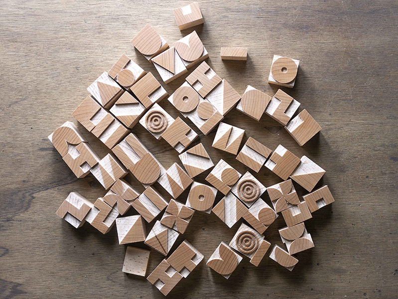
Joseph Albers (a student and later a teacher at the Bauhaus) developed a multiple modular lettering system informed by ten basic shapes, all derived from a circle and a square. Kombinationschrift – was designed to be efficient, in terms of ease of use and inexpensive to produce. Albers argued that these systems would be economical by saving on time and storage space. The resulting typeface was not as legible as others to emerge from the Bauhaus but Albers’ idea of ‘modularity’ was clearly in line with its philosophy, creating refined (streamlined) products for mass production.
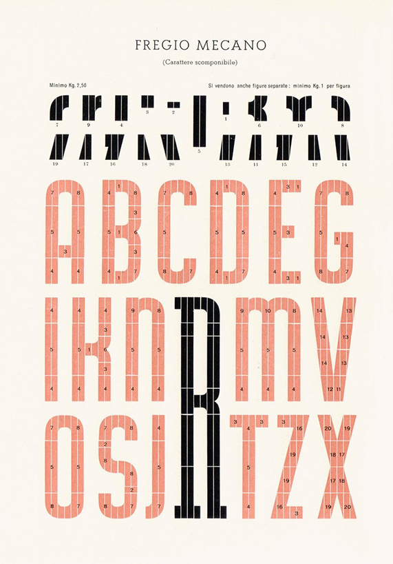
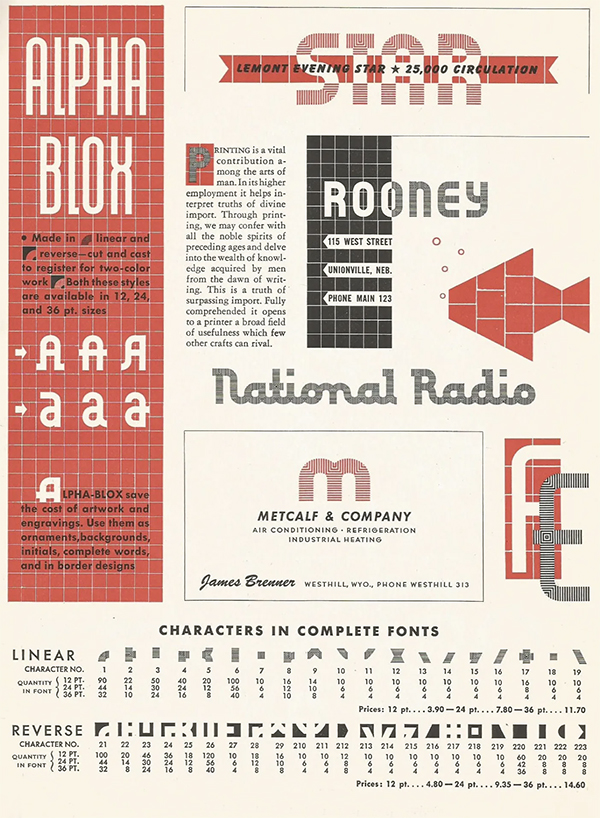
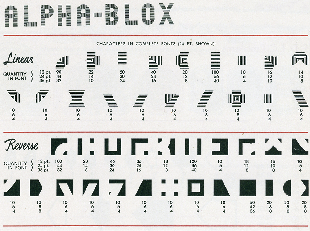
Modular type systems have been available across mainland Europe since the early 1920s – Fregio Mecano (Italy 1920) and Super Veloz1 (Spain, 1942) are two examples. A further example Alpha-blox – introduced by the American Type Founders (ATF) in 1944. Alpha-Blox is a system of individual elements, hand-set (similar to type and ornaments) but with the added facility which enabled the construction of lettering or borders from a wide number of different composite parts.
ATF made a boast similar to Albers during its release stating the system could “save the cost of artwork and engravings during these resource-tight-times” – sustainability in print at last! The reality is that all of these systems take much more time to assemble into lines of text than conventional type – but for some reason that is not stopping anyone from still using it!
Since the experiments and design propositions presented by the Bauhaus and others, developments in technology, material and process have moved on unimaginably. Computer aided design (CAD) affords a platform for designers to generate complex three-dimensional shapes and structures. But since its adoption CAD has struggled to generate forms that are able to supersede the circle, square or triangle. Perhaps this is why design disciplines regularly return to these basic forms, manipulate and represent them, propelled by new processes (and old – letterpress included) informed by new materials.
From the outset of the digital revolution type designers embraced emerging technology, pushing the visual envelope of how an alphabet could be represented. Some designers propose complex (almost illegible like Albers) solutions whilst others adopt a highly reductive approach – stripping elements down to the most basic of form. In recent years across the craft of letterpress, the generation of modular prints created using combinations of geometric elements specifically developed or re-appropriated for letterpress printing has been steadily on the increase.
In terms of printing history, specifically letterpress there has always been ornamental modular elements readily available and designed to compose along-side type. It helps balance and situate typo/graphic compositions – when in the right hands producing carefully considered juxtapositions of text and ornamentation. And even in the most basic application of ‘ruled line’ this helps to qualify hierarchy and guide the reader through complex passages of information. But, what about pure ornamentation, are there examples of letterpress printing without words?
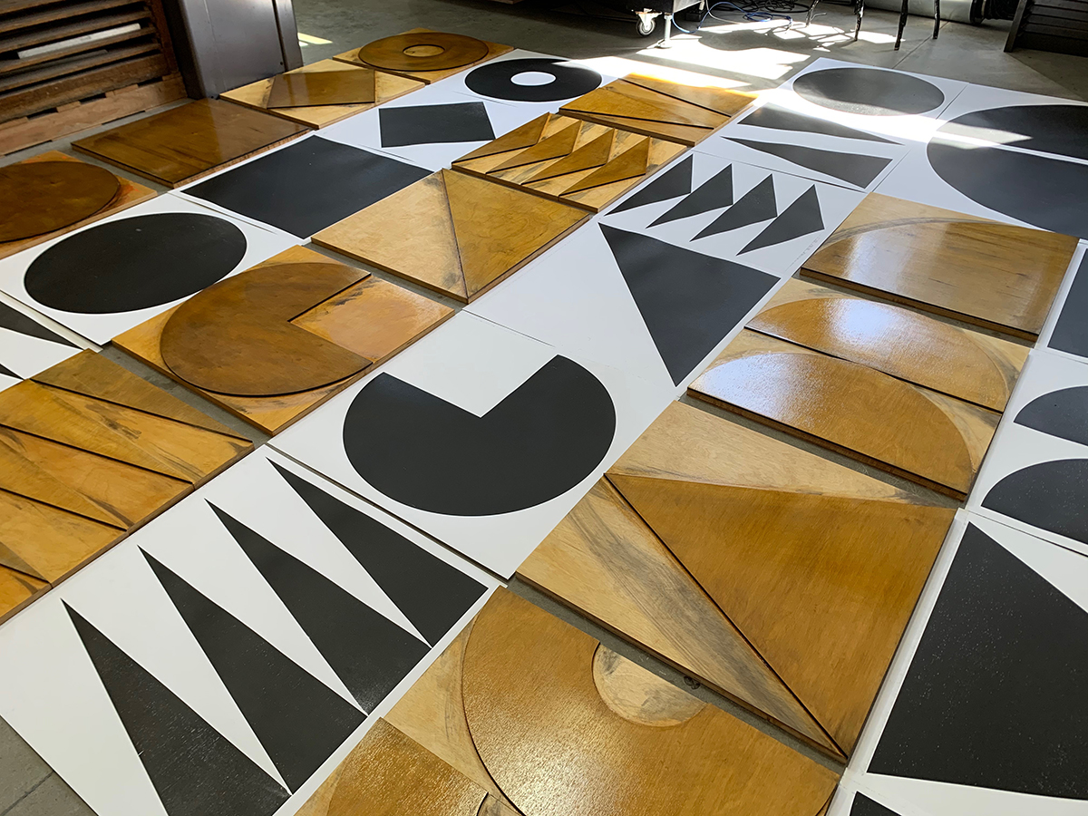
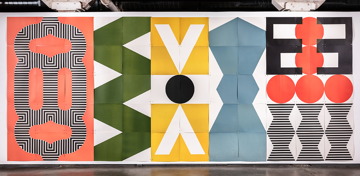
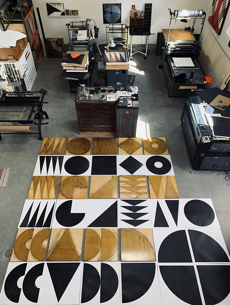
The following illustrates a number of brief case studies in and around the theme of modular letterpress printing, print production, methods, materials and the continuing fascination to the circle, square and triangle:
… … …
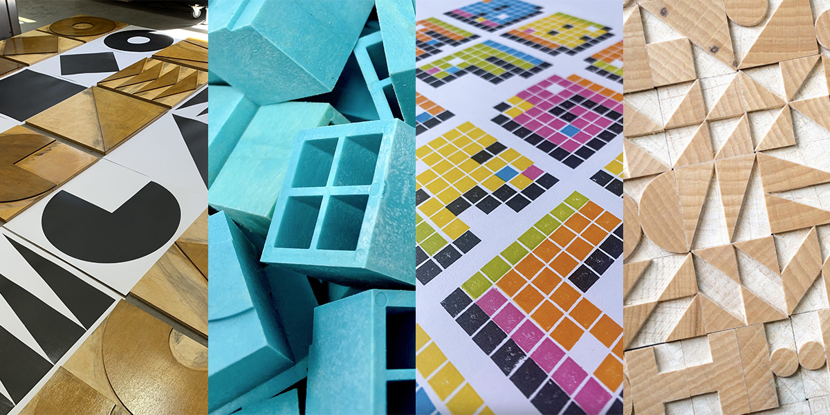
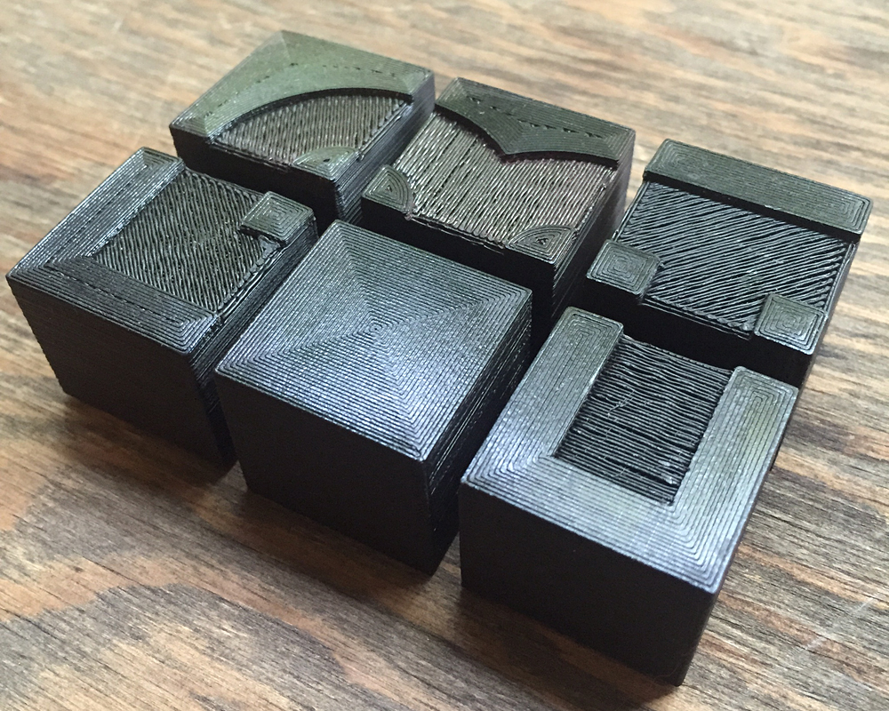
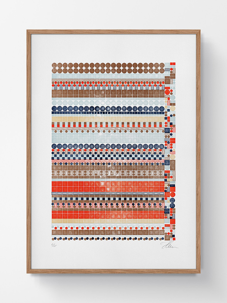
Richard Kegler | P22 Type Foundry | Blox
P22 Blox are a modern rendition of the ATF Alpha-blox. Manufactured from injection moulded plastic (image above: initial experiments with 3D printed letters). It affords users an experimental system to construct both pattern and letterform – one inch (72pt) at a time, using square modules produced in both positive and negative, module elements. The sample image below illustrates an approach to compose a modular alphabet by combining eight blocks per letter.
These modern plastic units help learners experience setting type by hand and are a great asset when introducing letterpress printing for the very first time. They are light-weight easy to work with, take ink and clean up comfortably after use – and they print well.
The P22 Blox project was created as a collaboration between Richard Kegler and Starshaped Press.
https://www.p22.com/family-Blox
… … …
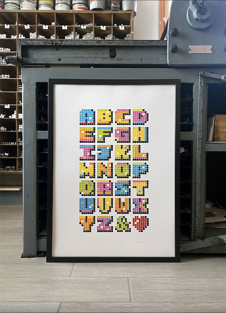
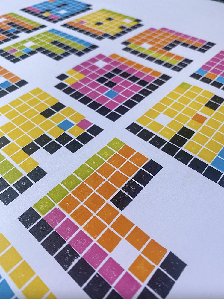
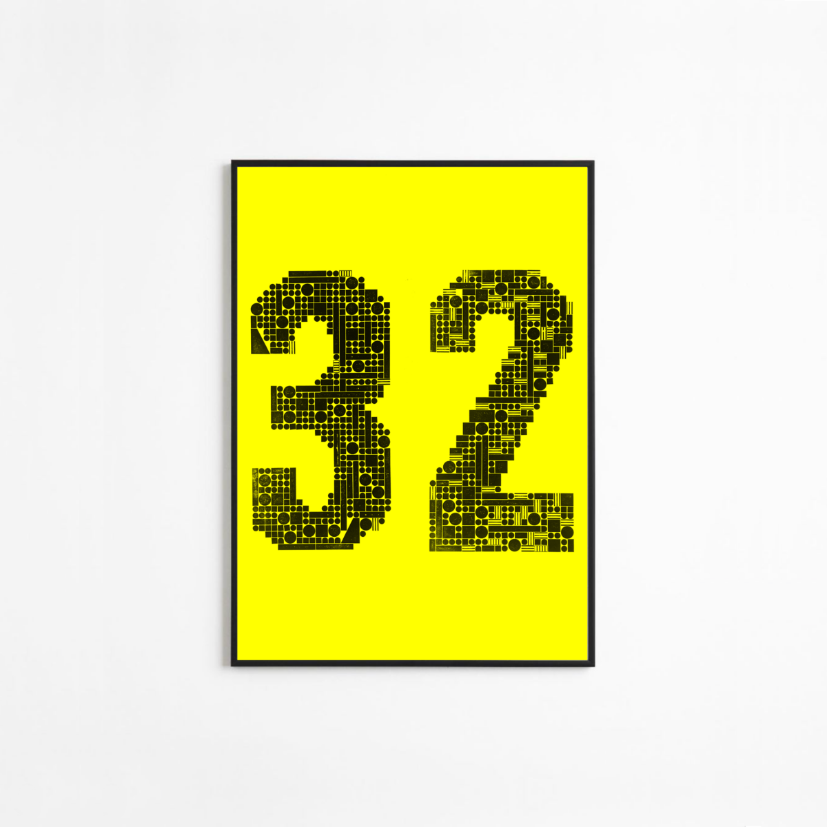
Chris Chandler | Neu Haus Press | Futura Schmuck
Futura Schmuck is a modern, geometric font / artwork composed of large scale circles, triangles, and squares. Taking its formative inspiration from the ATF Alpha-blox – just scaling it up a little.
The work experiments with modularity – setting and resetting the component parts in endless reassembling. Presented as a ‘retro-futurist’ typeface – it lives up to the original advertising ATF strap-line “the typeface of today and tomorrow” being actively used ninety years after its initial production. When inking elements at this scale there will always be slight imperfections coupled with tears, and creases created from large scale wheat pasting – these distress the prints, leaving a unique echo of the artist’s hand.
Each work is titled AB followed with a number indicating the order that the work was printed. A mathematic system qualifying both material and process. Chris navigates the whole creative journey design, manufacture, composition, ink and print through to installation – some of the larger works are assembled to create huge bill-board sized installations – scale is everything with this body of work.
… … …
Type High Design | Form Pattern
Form Pattern is a system of shapes – excellent for making patterned lines, areas and frames. The modular elements can also be combined to generate letters and alphabets. Each unit is manufactured with no side bearings so when assembled the shapes touch, edge to edge, ideal for generating complex geometric patterns.
“Its origin began in sketches while observing geometric patterned mosaics in the cities of Bari and Palermo in the south of Italy. These mosaics were found in Catholic churches, yet their creation was informed by different cultures and spiritual traditions that had influence in Italy over the centuries. They represent not only the intended purposes of the Church, but also due to their connection to the art of Islam…”

Form Pattern is made exclusively by typehighdesign – designed by Donald Tarallo.
https://www.typehighdesign.com/shop/p/geometric-letterpress-ornaments-r5d9e
… … …
Mark McKellier | McKellier Wood Type | Unicomodular
Mark manufactures a modular wooden typeface system based on a 1949 design by Martin Meijer. It was redrawn, digitalised before programming the coordinates into a CNC router for production. A very playful system of modular type design but also useful for pattern generation.
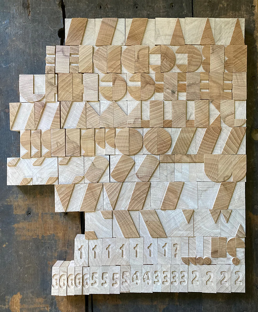
https://mckellier.com/products/new-8-line-3a-unicomodular-modular-font
… … …
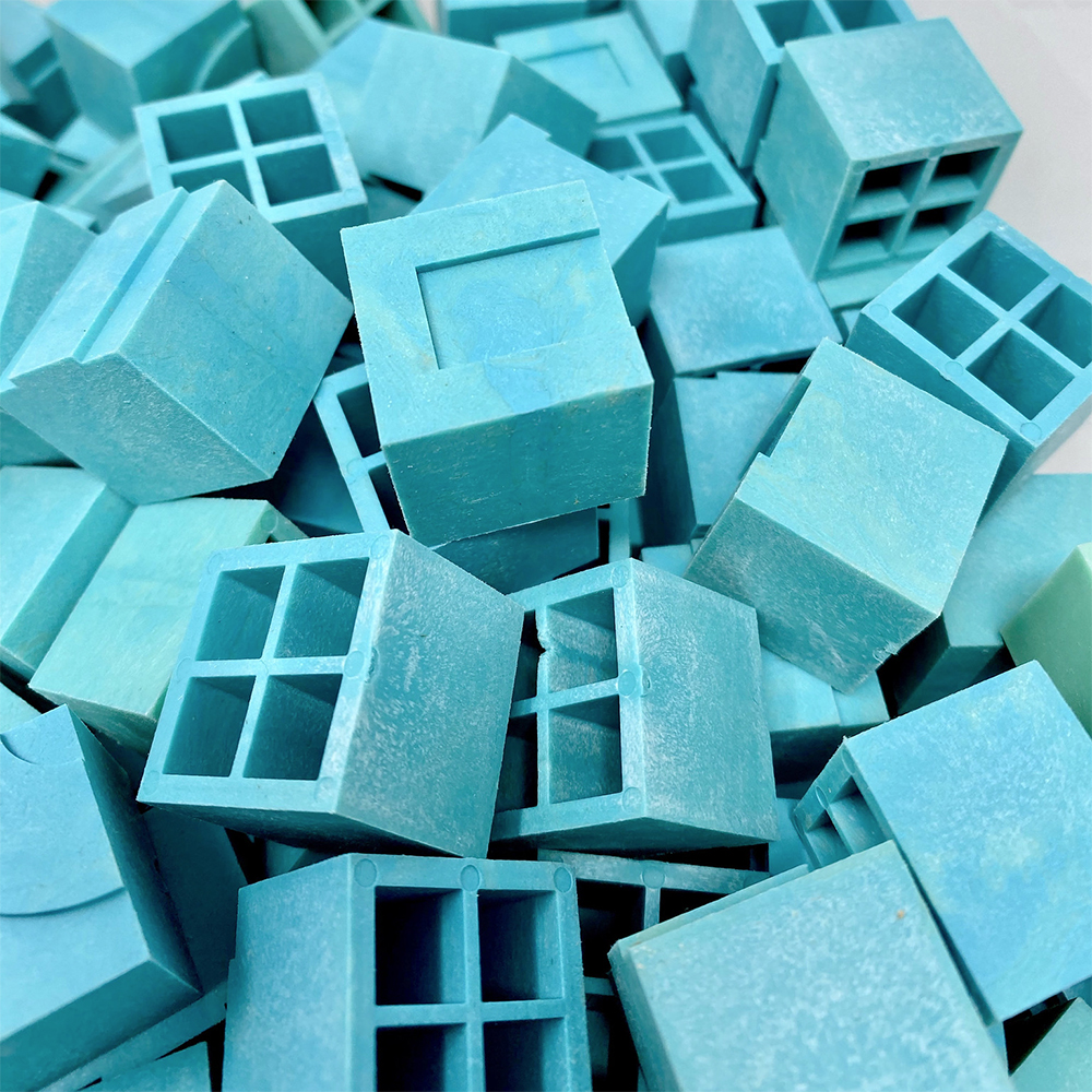
And then there was Lego…
Lego has been manufactured in Denmark since 1932 – injection moulded to exacting tolerances. Does this sound familiar? – perhaps this is why it has had a recent emergence in print studios having a useful synergy with letterpress printing.
… … …

… … …
Martina Vincenti | La Tipografa Toscana | Alphalego
Lego is modular, comes in a wide variety of elements that can be configured and reassembled to produce images, type, pattern and anything in fact – the only limitation is the creative thinking of its users! It is designed to be used, taken apart, stored and used again – perhaps the fact this process to the fundamentals of letterpress is what has been drawing printers attention to it?
Martina saw the potential of combining the base board and flat elements and embarked upon composing her own eight colour modular typeface. The resulting work is both beautiful and innovative – it helps to prove the value of experimenting with ‘things not designed to be printed’ pushing the envelope of contemporary letterpress printing.
The thin Lego base boards, once set and positioned on the bed of a cylinder press afford a very effective modular framework to work with. Calibrated to ‘type height’ (18mm plywood plus packing) away you go – the opportunities are limitless. The process is fast, clean and an ideal tool for workshops and teaching. Registration is comfortably achieved the only challenge is to ensure the smaller square tiles sit perpendicular to the baseboard (if that is what you are after).
https://www.latipografatoscana.it/en/product/a-l-f-a-l-e-g-o/
… … … …
Steve Garst | Provisional Press | Long Distance Letterpress
Steve Garst has developed and made hundreds of Provisional Press kits – an inexpensive and accessible ‘entrance level’ tool for letterpress printing. Designed produced and supplied throughout the Covid lock downs when workshop access was a challenge for so many.
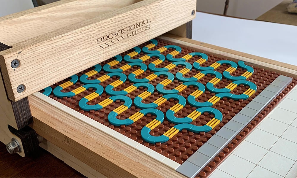
In his quest to make letterpress printing materials more accessible, he embraced the use of non-traditional and easy-to-source toy, materials – Lego being a primary example. His Long-Distance Letterpress initiative supports learners (of any age) wishing to venture into letterpress printing and experiment for the first time.
https://partnersinprint.org/event/long-distance-letterpress-provisional-press-printing-2/
https://www.provisionalpress.com/
… … …
Stellavie | Glitch Prints
This body of work takes inspiration from elements of error – the bugs, failures and flaws on computer monitors or digital screens that produce a variety of weird and extraordinarily graphic effects. The resulting work is a set of complex modular compositions, printed with Lego components in six layers of colour. From digital back to analogue.
The phenomena of ‘glitch’ is very modern one (screen age) but the production of this body of work follows a much more traditional analogue process – through the adoption of a cylinder proof press and a large number of Lego tiles. The resulting prints oscillate very successfully somewhere between past, present and future.
… … …
Carl Middleton | Studio B | Constellation
Initial experiments with Lego letterpress came out of an interest in modular type design but have developed into a larger body of experimental work. A set of numerals were developed for a collaboration with Pressing Matters Magazine, and Studio B (for the publication of the 20th edition) but the lack of components impeded on the project’s development.
A chance visit to the Lego shop (Milton Keynes) resulted in Lego being purchased ‘by volume’. Thereafter another Lego inspired project began, move in a slightly different minimal direction – the composition of modular constellations from single round tiles (8mm diameter) – Star constellations (below: cancer).

https://www.carlmiddleton.co.uk
… … …
Mike Sonnichsen | University of Idaho | Lego Letterpress Works
From a more decorative and colourful perspective Mike’s work follows the contemporary trend for Lego experimentation – subtle printed compositions explore colour, layout and the interplay of shape and form. The precise and modular nature of this type of printing affords limitless possibilities – whilst playfully resonating back to the origins of the component parts.

Symmetry is a very important factor in each composition coupled with the application of colour and layering – the resulting work is dynamic and visually arresting.
https://www.mikesonnichsen.com/llp
… … …
The allure of systems like Lego has its foundation in simplicity – deconstructing a form or letter into its purest elements, thereafter reconstructing it provide seemingly endless opportunities for experimentation, contemplation and discovery. Perhaps this is why Lego is such a successful children’s toy. And from what has been evidenced above enjoyable for adults too! – with huge opportunities for creative expression.
… … …
The list published above is not exhaustive and is only a small sample of contemporary modular letterpress work. Please see below for some further interesting project references.
… … …
Stirchley Print Works – UK
Lego Relief Printing
… … …
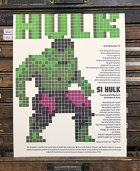
Justin Gonyea | Seattle Children’s Hospital Broadsides
https://www.boxcarpress.com/blog/category/letterpress-work/
… … …
Bright Press | Lego Letterpress Workshop
https://events.humanitix.com/lego-letterpress-workshop-for-young-people-7-12-october-2022
… … …
Virgin Wood Type | Modular Wood Type
Modular wood type takes inspiration from both the American Type Foundry’s Alpha-Blox and Fregio Mecano. Available in three sizes manufactured and finished by hand.
https://www.virginwoodtype.com/shop/product/modular-type/
… … … … … … … … … … … … … … … … … … … … … … … … … … … … … … … … … … … … … … … … … …
Please note: research for a future LPW Journal post
From a pedagogical stance, establishing an important topic such as learning the letters of the alphabet for kindergarteners through something like Lego letterpress could help encourage play, promote design whilst also engaging memory. This follows – What I hear, I forget – What I see, I remember – What I do, I understand.
Are there any successful applications of Lego Letterpress as a learning tool being adopted in classrooms currently?
If you know of any projects or initiatives or you are working on something which could supplement what is presented here please get in contact and where possible we will try to include it in a future journal post.
… … …